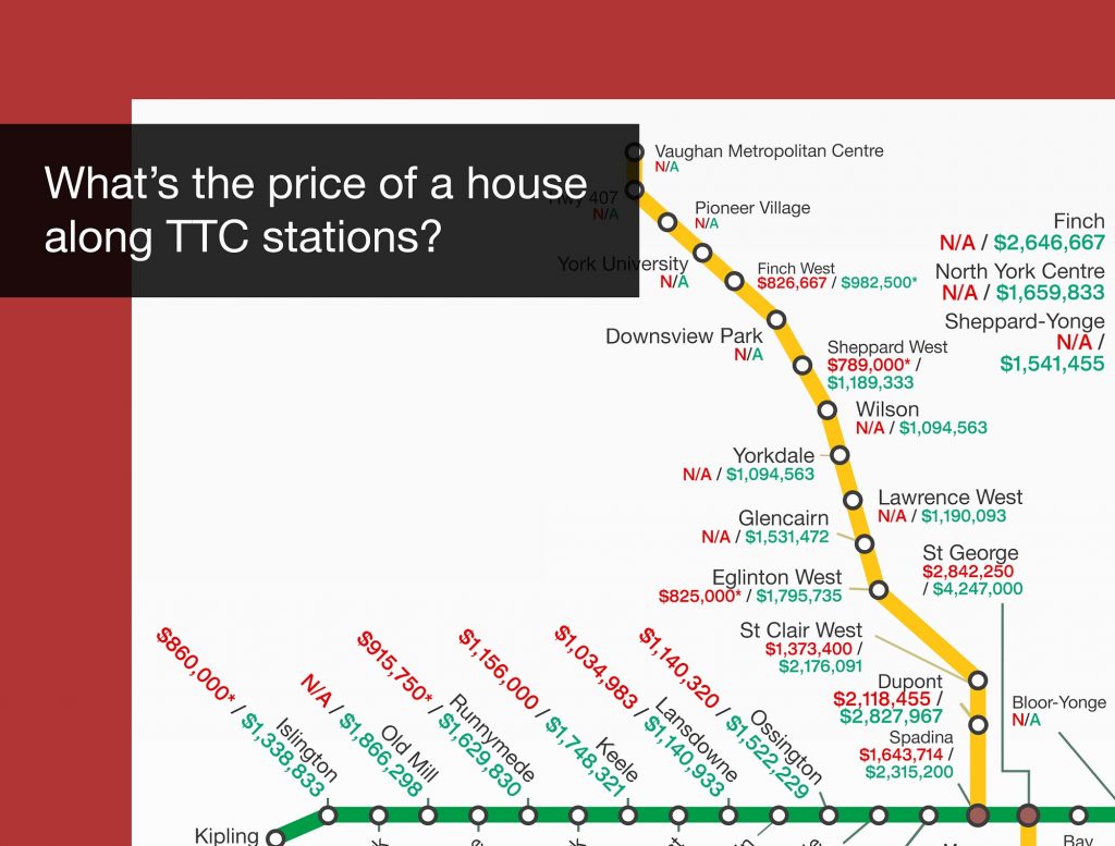
I made a map that easily visualizes what the average price of 1-bedroom and 2 bedroom condos were according to their sale prices in 2018. I’ve kept it to a 0.5km radius around each TTC station so that the condos are walking distance. Now you can hunt in the market armed with better knowledge!

Want to know what how condos fared between 2017 and 2018? Drop in your email and I’ll send you another FREE map that visualizes the difference a year made for 1-bedroom and 2-bedroom sale prices!
Drop in your email for the map.
We’ll also send you the 2017/2018 Difference Between Toronto Houses Along Each TTC Station!
[contact-form-7 id=”3040″ title=”TTC House Map 2019″]